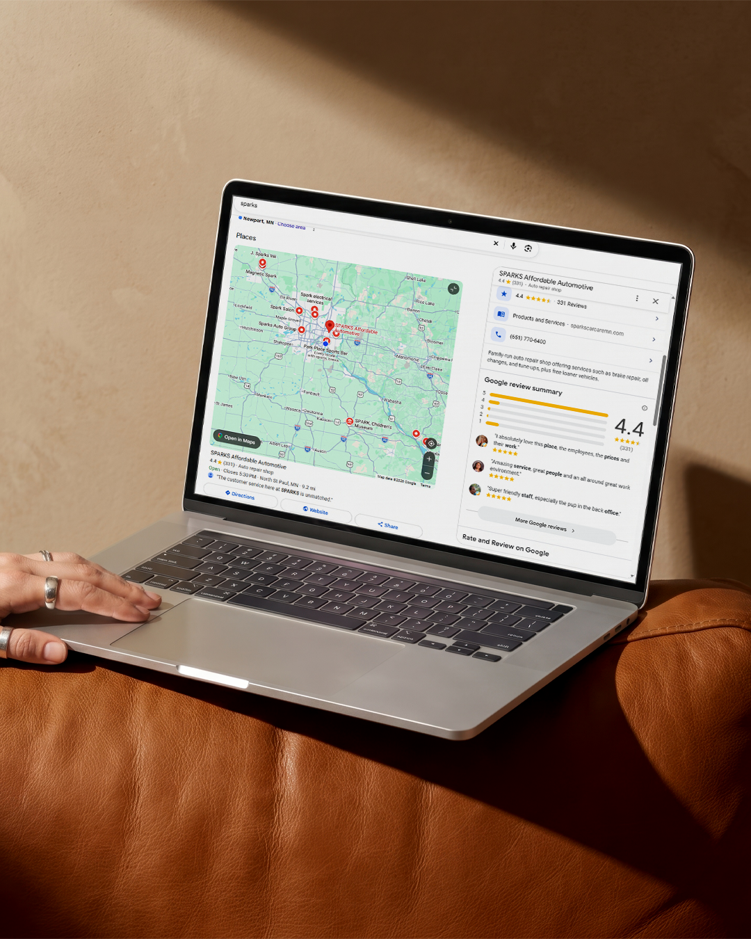
In 2025, more than 60% of all global web traffic comes from mobile devices — around double the figure from 10 years ago. It’s safe to say that many of the people visiting your site do so on devices like smartphones. That’s why creating a mobile-friendly website is essential for any modern business.
On a mobile-friendly website, users can easily view and navigate the content using smaller screens. They probably won’t stick around on websites that lack a mobile-first design because they’re clunky and difficult to use.
Luckily, delivering a positive mobile user experience on your website isn’t as complicated as it may sound. Use this guide to upgrade your business to a mobile-friendly site in a few simple steps.
What Is a Mobile-Friendly Website?
A mobile-friendly website provides a seamless user experience for people using mobile devices. If you’ve ever opened a website on your phone and noticed that the fonts were strange sizes, images were cut off, and it was difficult to navigate to other pages, that website was definitely not mobile-friendly.
Key hallmarks of a mobile-friendly website include:
- A layout that fits the mobile screen size well
- Text that's easy to read
- Buttons that are easy to tap on a touchscreen
- Easy site navigation
- Fast mobile site speed
Some businesses design separate mobile websites that adjust the desktop version to better work for mobile users. However, responsive design is the better approach. But what is responsive design?
With a responsive or adaptive design, you need to create only one version of your website. Then, your site will automatically adjust to fit any screen size and deliver the best mobile user experience.
Why Mobile Optimization Is Essential
Mobile optimization is about more than just making your website look good on smaller devices — it directly impacts user engagement. Think about it this way: Would users rather stay on a site that’s easy to use on their device or one that’s clunky and difficult?
If your website delivers a poor mobile experience, you’ll probably see a higher bounce rate. Users click on websites with low mobile-friendliness and then quickly click away because of the poor experience.
The good news is that working on an appealing mobile website should address these issues and offer benefits like:
- Increased user engagement: A positive mobile experience keeps users on the site longer and encourages them to explore more content.
- Higher conversion rates: When users can easily find what they need on a mobile site, they're more likely to convert (e.g., make a purchase, fill out a form).
- Enhanced brand image: A mobile-friendly website reflects well on a brand, demonstrating that it values the user experience.
How a Mobile-Friendly Website Impacts SEO
The design of your mobile website also plays a key role in how high you rank on the search engine results pages. Google, for example, uses mobile-first indexing, which means it uses the mobile version of a website to determine the site’s ranking. So good mobile performance contributes to better search engine visibility.
You might be surprised by the difference having a better mobile website makes to your mobile SEO efforts, one of the biggest trends in digital marketing services.
Tips for Making Your Website Mobile-Friendly
There are a few key areas you should focus on to improve your site’s mobile-friendliness. Before you start changing things, make sure you keep these tips in mind.
The Importance of a Responsive Web Design
Responsive design is now the standard for modern websites because it allows them to seamlessly adapt to any device or screen size. With responsive design, you don’t have to worry about your site appearing strangely or being less user-friendly on mobile devices — it adjusts automatically.
With your fluid layouts and flexible grids, avoid fixed sizing on elements like images. Allow everything to adjust proportionally to the screen size of each user’s device.
In your broader design, focus on making fonts large and readable, using simplified menus that are easy to navigate, and incorporating large, clickable interactive elements such as buttons and forms.
Mobile Performance and Site Speed
Your mobile site speed is another vital component of optimizing for mobile devices. Mobile users generally won’t wait long for a page to load before clicking away in frustration. Optimizing your page speed makes your website much more enjoyable to use, meaning mobile users will probably stick around longer.
Improve your mobile site speed by:
- Compressing images
- Using lazy-loading images, which load only when users reach that part of the page
- Enabling browser caching to store data on the user’s mobile device
- Removing unnecessary code and minimizing file sizes
Content and Usability on Smaller Screens
The easier your mobile website is to use, the better. Make these adjustments to improve your usability for mobile users:
- Use large font sizes that are easy to read.
- Add plenty of white space to break up text and images.
- Make your content scannable with headers, subheaders, and bullet points or numbered lists.
- Incorporate thumb-friendly buttons that are large enough to easily click on a touchscreen.
- Add simplified navigation menus that make it convenient for mobile users to find what they’re looking for.
Tools to Test Your Mobile-Friendliness
The easiest way to test whether your changes have actually made your website more mobile-friendly is to open it on a few different mobile devices. Navigate around and see if you encounter any issues. You want your mobile website to be as user-friendly and usable as the desktop version.
Additionally, you can use tools like:
- The Google Mobile Friendliness Test, which tells you whether your site passes or fails at being usable on mobile devices
- PageSpeed Insights, which analyzes your website’s user experience on mobile devices, including whether your pages load in less than a second on mobile networks
Ready to Boost Your Mobile Rankings?
If your site isn’t optimized for mobile devices, you’re missing out on valuable opportunities to connect with users and drive more conversions. Make these mobile-friendly adjustments now to get more out of your site.
And if you want some help with making your website mobile-friendly, the experts at Optimize Digital Marketing are here for you. Reach out today to get started.